In today’s digital era, more than 70% of web traffic comes from smartphones and tablets. If your business website isn’t mobile-friendly, you’re not just delivering a poor experience — you’re losing customers.
Mobile-responsive design isn’t a trend. It’s a necessity for any business looking to grow online. In this blog, we’ll explore why mobile responsiveness is critical to business success and how it affects your visibility, user experience, and revenue.
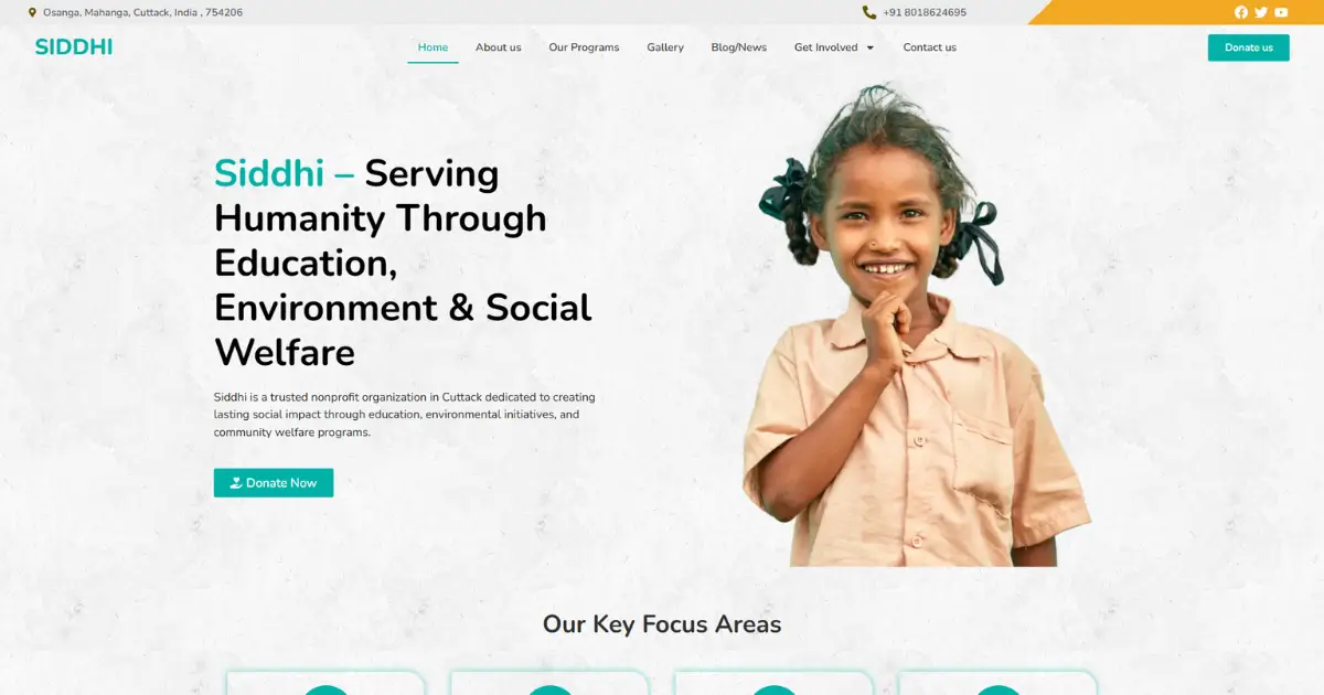
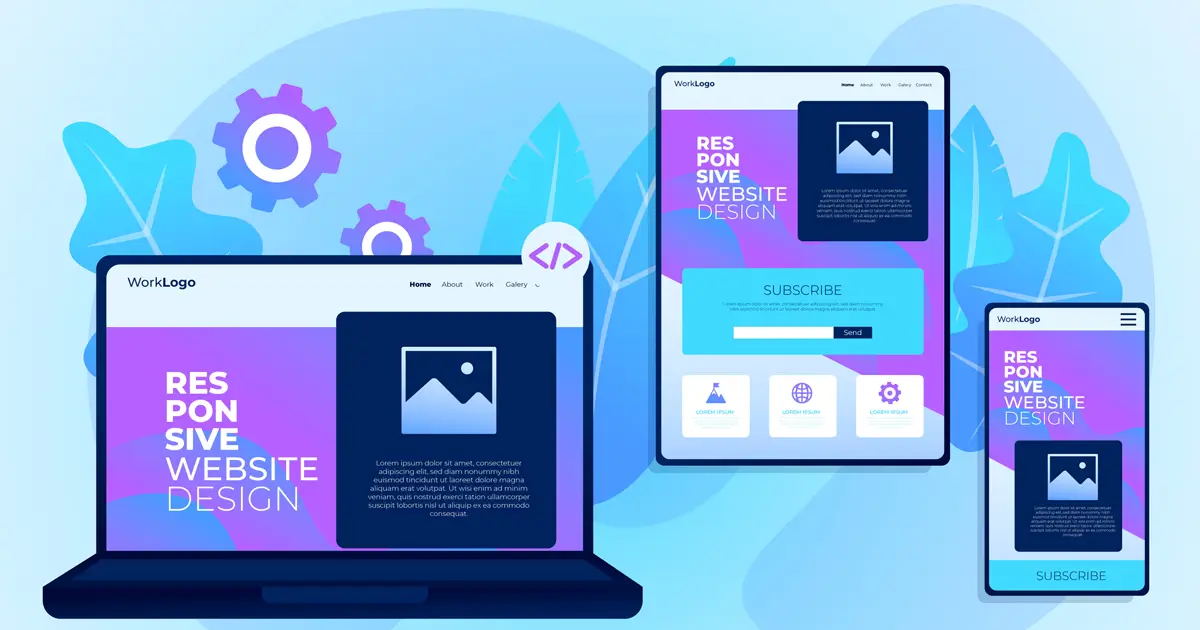
A mobile-responsive website automatically adjusts its layout, images, and content based on the device screen size — whether it’s a phone, tablet, or desktop.
A responsive site ensures every visitor has a smooth, consistent experience, regardless of the device they’re using.
Since the introduction of mobile-first indexing, Google ranks and indexes the mobile version of your site before the desktop version.
If your website isn’t responsive, it can hurt your SEO rankings and decrease your visibility on search engines.
✅ Mobile responsiveness = better Google rankings = more organic traffic
Visitors expect a seamless experience on mobile. A non-responsive site can lead to:
A responsive design keeps users engaged, encourages browsing, and increases the chances of conversion.
Users are more likely to take action (buy, contact, sign up) when they can navigate your site easily.
With responsive design:
The easier the experience, the more likely users are to trust your brand and convert.
First impressions matter. A non-responsive, broken mobile site reflects poorly on your professionalism.
On the other hand, a responsive, fast-loading website builds credibility and trust.
In a competitive market, customers will quickly leave a poorly designed site and go to your competitor.
Mobile users expect websites to load in under 3 seconds. A responsive website loads faster by:
Google considers page speed a ranking factor — and a slow site equals lost leads.
At iSmart Web Service, every website we build is:
Whether it’s a business site, nonprofit, or e-commerce store — we prioritize mobile-first design to help you succeed online.
If your website isn’t mobile-responsive, you’re not just behind — you’re invisible to a large part of your audience. Investing in a mobile-first design isn’t just good practice; it’s essential for staying competitive in 2025 and beyond.
Let us help you build a mobile-optimized, conversion-ready website that drives real results.